In a previous post we discussed the interpretation of the strength of evidence coming from a Bayes factor. For concreteness, let’s take a binomial data set and suppose we have encountered 62 successes and 38 failures in a sample of 100 trials. We can easily enter these data directly using the JASP Summary Stats Module:
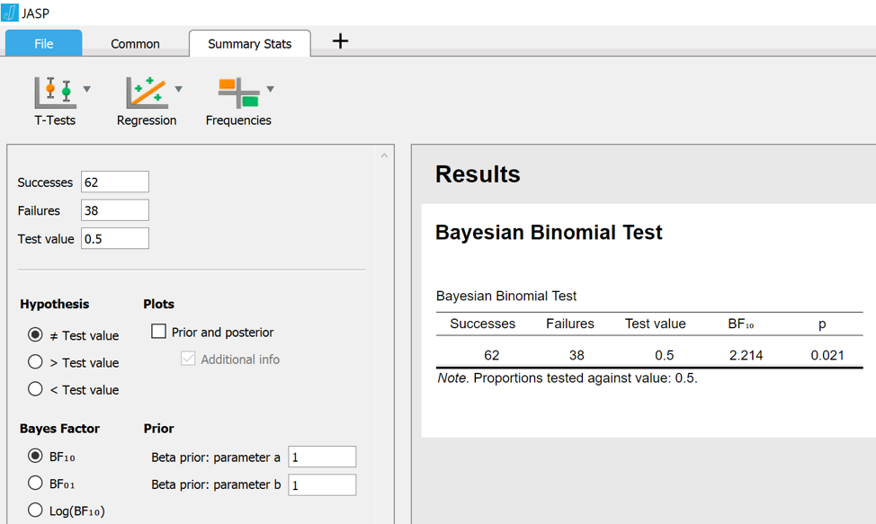
The JASP output shows that for these data, the classical two-sided p-value is .021 (in most applications, researchers would feel entitled to “reject the null hypothesis that the result is due to chance”). The Bayes factor indicates that the data are 2.2 times more likely under the alternative hypothesis H1 than under the null hypothesis H0. The null hypothesis H0 is specified by the number after “Test value”; in this case, H0 says that the binomial rate parameter equals 0.5. The alternative hypothesis is specified by a beta distribution with “parameter a” set to 1 and “parameter b” set to 1 (other distributions may be specified, but that is the topic of a different post). To understand the result more deeply, let’s tick the box “Prior and posterior”, which produces the following graph:
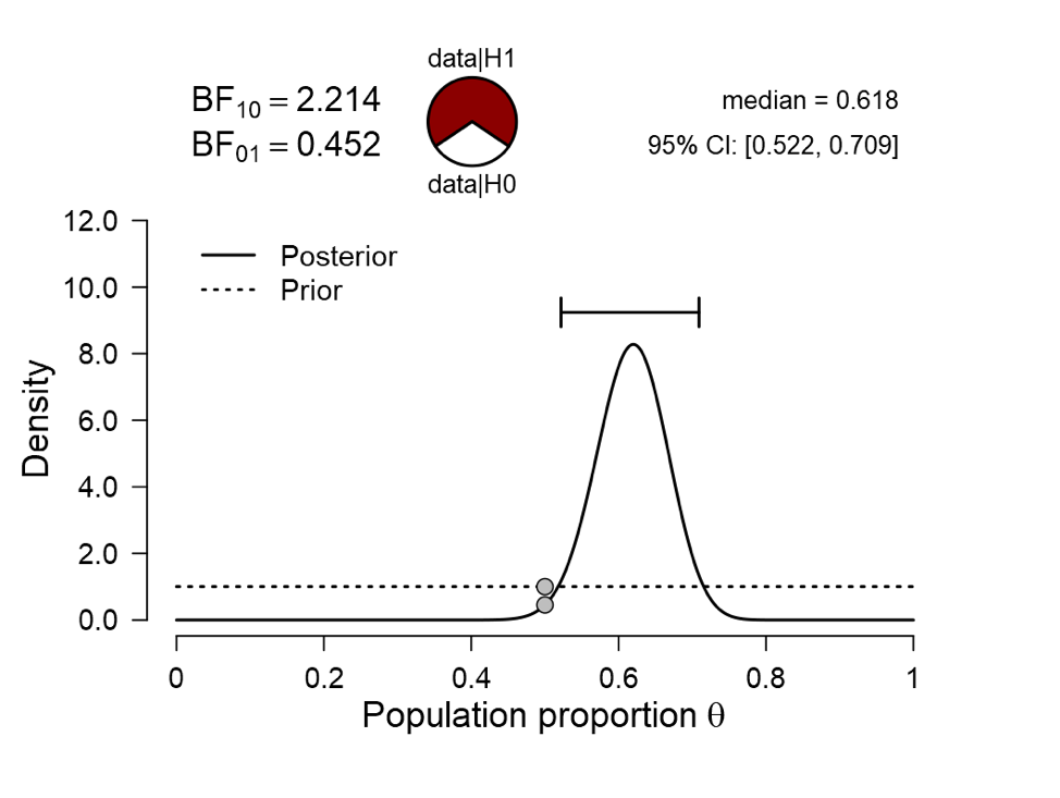
The dotted line show the prior distribution (i.e., the beta distribution with a=1 and b=1) under the alternative hypothesis; the solid line show the posterior distribution. With 62 successes and 38 failures we know that the posterior is also a beta distribution with parameters a’ = 1+62 and b’ = 1+38, but such analytical niceties are not important for the interpretation of the result. What we can see from the figure is that, assuming we started by specifying a beta(1,1) distribution for the rate 

Enter the Bayes factor, which considers the predictive adequacy of the skeptics’ H0 (i.e., 


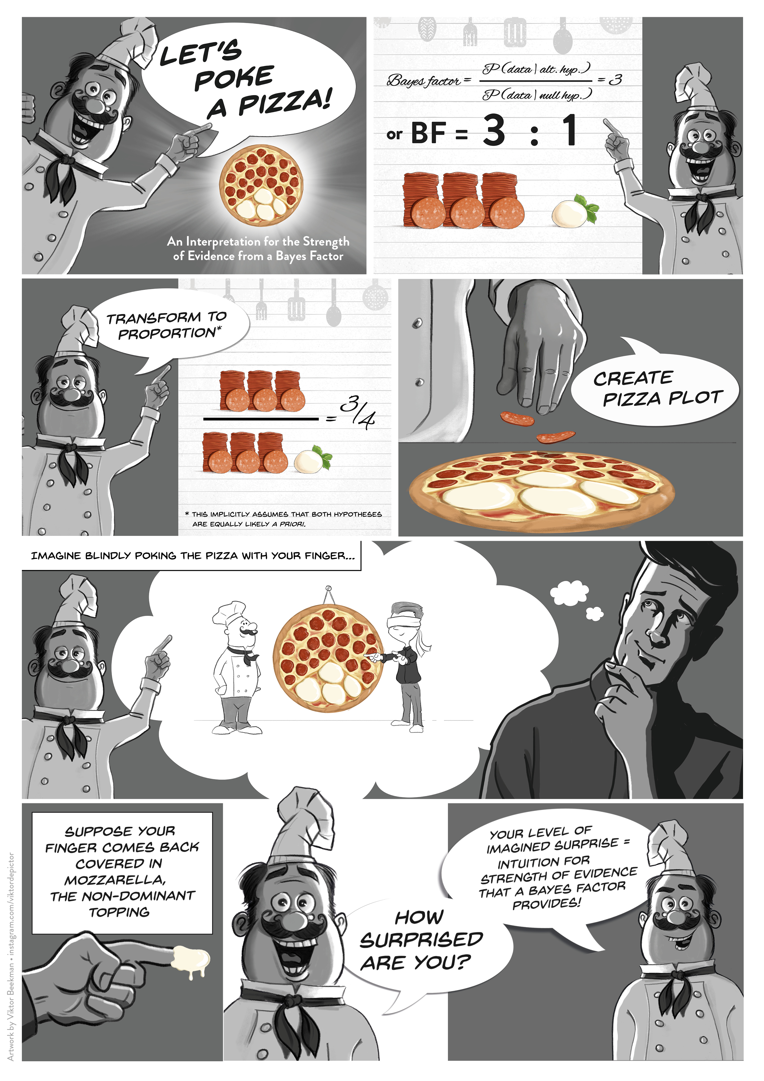
In the pizza plot, the red “pepperoni” slice corresponds to the 69% for H1, and the white “mozzarella” slice corresponds to the 31% for H0. As mentioned in the earlier post: “To feel how much evidence this is, we may mentally execute the “Pizza-poke Assessment of the Weight of evidence” (PAW): if you pretend to poke your finger blindly in the pizza, how surprised are you if that finger returns covered in the non-dominant topping?” In this case, you poke your finger onto the pizza and it comes back covered in mozzarella. Your lack of imagined surprise means that you should be wary of interpreting the data as strong evidence against the null hypothesis. More generally, note how much more information is communicated in the JASP graph compared to the standard frequentist conclusion “p=.021” (and, when you’re lucky, a 95% confidence interval on the parameter).
In the cartoon library on this blog you will encounter two cartoons that try to explain the pizza plot logic. One is about throwing darts and the other is about a spinner. During my workshops, however, I found that I discussed the pizza plot in terms of a pizza rather than darts or spinners. Finally I decided that what was needed to explain the pizza plot is a cartoon featuring pizzas. So here it is, courtesy of the fabulous Viktor Beekman:
References
Jeffreys, H. (1939). Theory of Probability. Oxford: Oxford University Press.
Ly, A., Raj, A., Marsman, M., Etz, A., & Wagenmakers, E.-J. (in press). Bayesian reanalyses from summary statistics: A guide for academic consumers. Advances in Methods and Practices in Psychological Science.
About The Author