 TL;DR We just preprinted a manuscript on how to teach the correlation coefficient with rectangles and squares. Check out the cool pictures. Suggestions for improvement are welcome.
Abstract
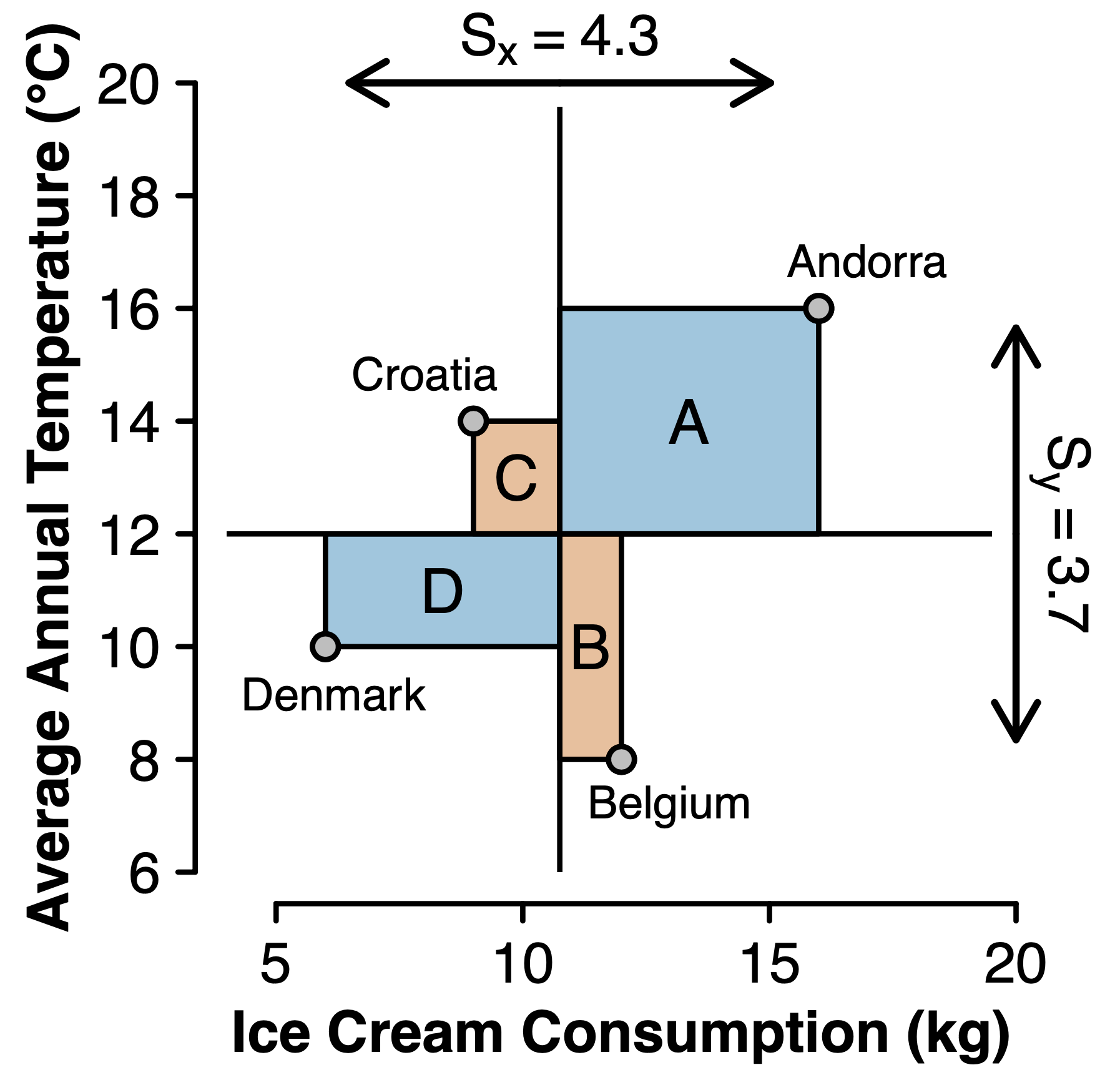
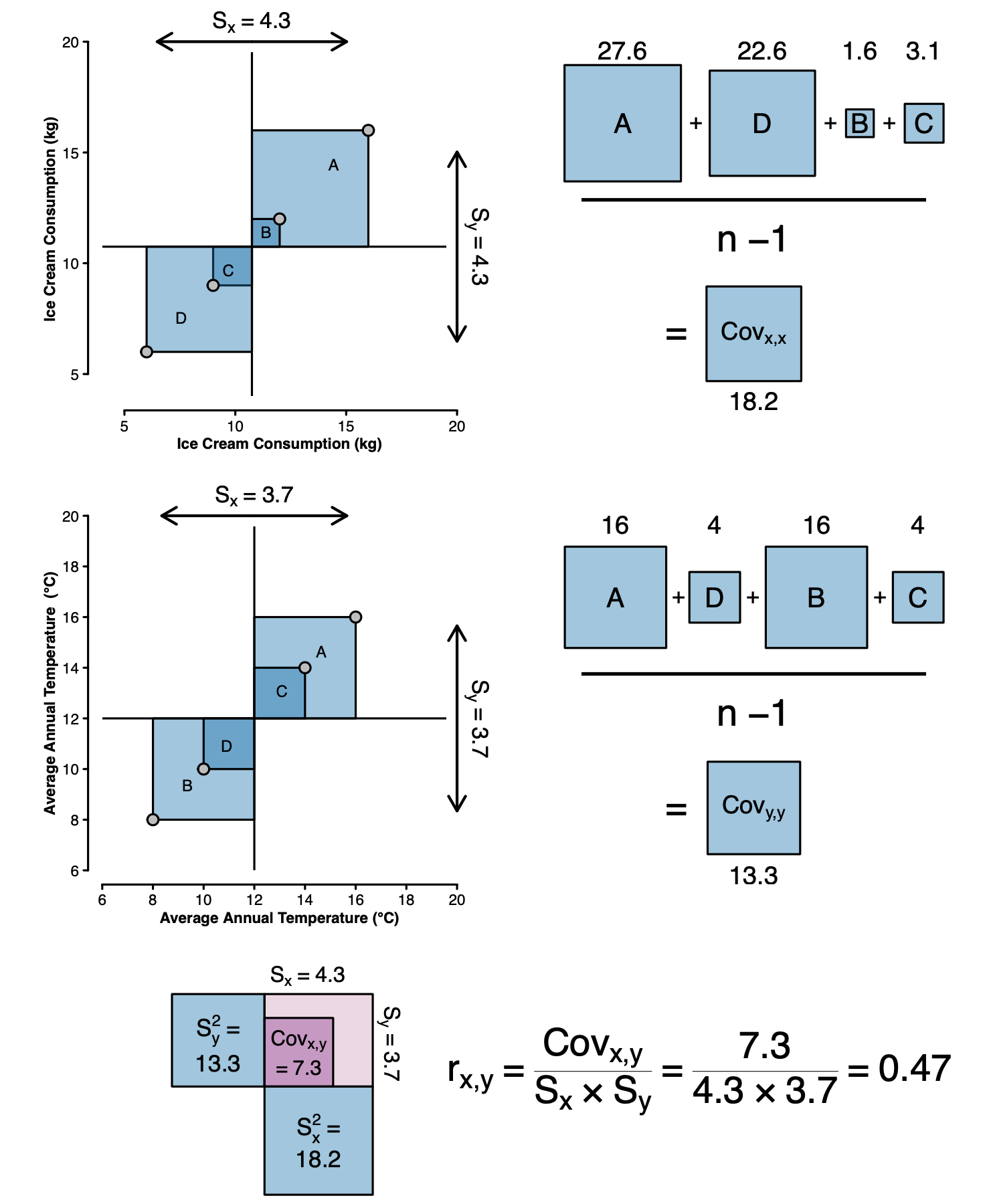
The equation for the Pearson correlation coefficient can be represented in a scatter plot as the difference in area between concordant and discordant rectangles, scaled by an area that represents the maximum possible concordance. Rarely employed in statistics textbooks, this simple visualization may facilitate a deeper understanding of the nature of the correlation coefficient.
A Teaser Plot
References
Wagenmakers, E.-J., Godmann, H., De Ruiter, J. P., & van Doorn, J. (2023). Visualizing the equation for the sample correlation coefficient. Preprint URL: https://psyarxiv.com/gwu8b
About The Authors

Eric-Jan Wagenmakers
Eric-Jan (EJ) Wagenmakers is professor at the Psychological Methods Group at the University of Amsterdam.

Henrik Godmann
Henrik Godmann is a Psychology Research Master student at the University of Amsterdam.

J.P. de Ruiter
Professor at Tufts University.

Johnny van Doorn
Assistant Professor at the University of Amsterdam.